
inline
html
<!DOCTYPE html>
<html lang="en">
<head>
<meta charset="UTF-8">
<meta name="viewport" content="width=device-width, initial-scale=1.0">
<title>Document</title>
<link rel="stylesheet" href="./css/03_display_inline_block.css">
</head>
<body>
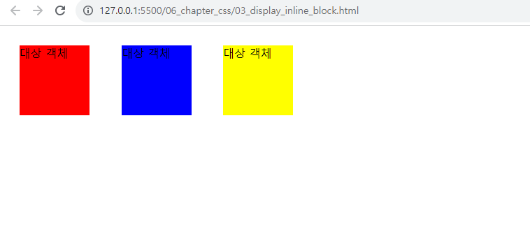
<div class="box">대상 객체</div>
<div class="box2">대상 객체</div>
<div class="box3">대상 객체</div>
</body>
</html>
css
/* 자동 정렬 : ctrl + alt + l */
/* inline-block(인라인블럭) : div 속성 + 줄바꿈 없음(속성) */
/* 활용 : 세로배치 -> 가로배치 디자인 적용하고자 할때 사용 */
/* 예) ul - li(block 속성, 세로메뉴) -> 가로메뉴(위의 속성 고려) */
.box {
/* 가로크기 */
width: 100px;
/* 세로크기 */
height: 100px;
/* 배경색 */
background-color: red;
/* 바깥여백 */
margin: 20px;
/* display 속성 */
display: inline-block;
}
.box2 {
/* 가로크기 */
width: 100px;
/* 세로크기 */
height: 100px;
/* 배경색 */
background-color: blue;
/* 바깥여백 */
margin: 20px;
/* display 속성 */
display: inline-block;
}
.box3 {
/* 가로크기 */
width: 100px;
/* 세로크기 */
height: 100px;
/* 배경색 */
background-color: yellow;
/* 바깥여백 */
margin: 20px;
/* display 속성 */
display: inline-block;
}
결과
none
html
<!DOCTYPE html>
<html lang="en">
<head>
<meta charset="UTF-8">
<meta name="viewport" content="width=device-width, initial-scale=1.0">
<title>Document</title>
<link rel="stylesheet" href="./css/04_display_none.css">
</head>
<body>
<span>더미 객체</span>
<div id="box">대상 객체</div>
<span>더미 객체</span>
</body>
</html>
css
<!DOCTYPE html>
<html lang="en">
<head>
<meta charset="UTF-8">
<meta name="viewport" content="width=device-width, initial-scale=1.0">
<title>Document</title>
<link rel="stylesheet" href="./css/04_display_none.css">
</head>
<body>
<span>더미 객체</span>
<div id="box">대상 객체</div>
<span>더미 객체</span>
</body>
</html>
결과

display
html
<!DOCTYPE html>
<html lang="en">
<head>
<meta charset="UTF-8">
<meta name="viewport" content="width=device-width, initial-scale=1.0">
<title>Document</title>
<link rel="stylesheet" href="./css/05_exam_display.css">
</head>
<body>
<h3>이미지 갤러리</h3>
<ul>
<li><img src="./img/cat.jpg" alt="고양이"></li>
<li><img src="./img/bee.jpg" alt="벌"></li>
<li><img src="./img/rabit.jpg" alt="토끼"></li>
</ul>
</body>
</html>
css
ul {
/* 배경색 */
background-color: #f5f7e4;
/* 외곽선 */
/* border: 선두께 선스타일 선색상 */
border: 1px solid #cccccc;
/* 둥근 사각형(모서리) */
border-radius: 10px;
/* 가로 크기 */
width: 640px;
/* 안쪽 여백 */
padding: 30px;
}
li {
/* 앞에 목록 점 없애기 */
list-style-type: none;
/* 바깥여백 - 왼쪽 */
margin-left: 20px;
/* display : 가로 배치 */
display: inline-block;
}
결과

menu
html
<!-- 06_exam_menu.html -->
<!DOCTYPE html>
<html lang="en">
<head>
<meta charset="UTF-8">
<meta http-equiv="X-UA-Compatible" content="IE=edge">
<meta name="viewport" content="width=device-width, initial-scale=1.0">
<title>Document</title>
<link rel="stylesheet" href="./css/06_exam_menu.css">
</head>
<body>
<h3>1. 세로 메뉴</h3>
<ul id='v_menu'>
<li>CEO 인사말</li>
<li>조직도</li>
<li>전화번호 안내</li>
<li>찾아오시는 길</li>
</ul>
<h3>2. 가로 메뉴</h3>
<ul id='h_menu'>
<li class='menus'>회사소개</li>
<li>|</li>
<li class='menus'>제품안내</li>
<li>|</li>
<li class='menus'>고객센터</li>
<li>|</li>
<li class='menus'>매장안내</li>
</ul>
</body>
</html>
css
li {
/* 앞에 점 없애기 */
list-style-type: none;
}
/* 세로 메뉴 디자인 */
#v_menu {
/* 가로 */
width: 150px;
}
/* 후손선택자 */
#v_menu li {
/* 안쪽 여백 */
padding: 5px;
/* 외곽선 : 아래 : 선크기 선스타일(점선) 선색상 */
border-bottom: 1px dotted black;
}
/* 가로 메뉴 디자인 */
/* 후손선택자 */
#h_menu li {
/* display : 가로배치 */
display: inline-block;
}
.menus {
/* 글자색 */
color: green;
/* 바깥여백 : 왼쪽/오른쪽 */
margin-left: 20px;
margin-right: 20px;
}
결과

ㅇㅇ
html
css
결과
ㅇㅇ
html
css
결과
ㅇㅇ
html
css
결과
ㅇㅇ
html
css
결과
absolute position 절대좌표
html
<!DOCTYPE html>
<html lang="en">
<head>
<meta charset="UTF-8">
<meta name="viewport" content="width=device-width, initial-scale=1.0">
<title>Document</title>
<link rel="stylesheet" href="./css/12_position_absolute.css">
</head>
<body>
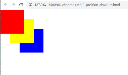
<div class="box"></div>
<div class="box2"></div>
<div class="box3"></div>
</body>
</html>
css
/* position: absolute(절대좌표) , */
/* 특징 : 웹브라우저 화면에 좌표가 생김,
left/top 이용해서 태그를 이동시킬 수 있음 */
/* 참고 : position:static(기본, 생략, 좌표없음),
html 기본 속성 : 태그가 코딩된 순서대로 밑으로 밀려서 화면에 표시됨
*/
.box {
/* 가로 */
width: 100px;
/* 세로 */
height: 100px;
/* 배경색 */
background-color: red;
/* 절대좌표(absolute) */
position: absolute;
/* 왼쪽 (x좌표) */
left: 0;
/* 위쪽(y좌표) */
top: 0;
/* 겹칠 때 위에 올라오도록 우선순위를 정하는 속성 */
/* 규칙 : 수치가 클수록 위, 수치가 작을수록 아래 */
z-index: 30;
}
.box2 {
width: 100px;
height: 100px;
background-color: yellow;
/* 절대 좌표 */
position: absolute;
/* 왼쪽 (x좌표) */
left: 40px;
/* 위쪽(y좌표) */
top: 40px;
z-index: 20;
}
.box3 {
width: 100px;
height: 100px;
background-color: blue;
position: absolute;
/* 왼쪽 (x좌표) */
left: 80px;
/* 위쪽(y좌표) */
top: 80px;
z-index: 10;
}
결과
relative position 상대좌표
html
<!DOCTYPE html>
<html lang="en">
<head>
<meta charset="UTF-8">
<meta name="viewport" content="width=device-width, initial-scale=1.0">
<title>Document</title>
<link rel="stylesheet" href="./css/13_position_relative.css">
</head>
<body>
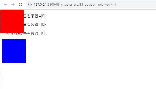
<p>안녕하세요. 홍길동입니다.</p>
<p>안녕하세요. 홍길동입니다.</p>
<p>안녕하세요. 홍길동입니다.</p>
<div class="abox"></div>
<div class="rbox"></div>
</body>
</html>
css
/* 상대좌표(relative) 예제 */
/* 특징 : 현재 태그가 있는 위치부터 (0,0) 시작됨 */
/* vs 절대좌표 : 0,0(웹브라우저 왼쪽/위 모서리) */
/* 절대좌표로 설정된 박스 */
.abox {
/* 가로 */
width: 100px;
height: 100px;
background-color: red;
position: absolute;
/* 왼쪽 */
left: 0;
/* 위쪽 */
top: 0;
}
/* 상대좌표로 설정된 박스 */
.rbox {
/* 가로 */
width: 100px;
height: 100px;
background-color: blue;
/* 상대좌표 */
position: relative;
/* 왼쪽 */
left: 0px;
/* 위쪽 */
top: 0;
}
결과
relative absolute
html
<!DOCTYPE html>
<html lang="en">
<head>
<meta charset="UTF-8">
<meta name="viewport" content="width=device-width, initial-scale=1.0">
<title>Document</title>
<link rel="stylesheet" href="./css/14_pos_relative_absolute.css">
</head>
<body>
<p>안녕하세요. 홍길동입니다.</p>
<p>안녕하세요. 홍길동입니다.</p>
<p>안녕하세요. 홍길동입니다.</p>
<div class="parent">
<div class="box"></div>
<div class="box2"></div>
</div>
</body>
</html>
css
/* 부모(relative) + 자식(absolute) 같이 사용하면 현상? */
/* TODO: 자식 div 태그에 absolute의 (0,0) 웹브라우저가 아니라,
TODO: 부모 div 박스의 왼쪽/위 모서리로 (0,0) 변경됨
*/
/* 부모 박스 */
.parent {
/* 가로 */
width: 500px;
/* 세로 */
height: 500px;
border: 1px solid gray;
/* 상대좌표 : 부모 */
position: relative;
}
.box {
/* 가로 */
width: 100px;
height: 100px;
background-color: red;
/* 절대좌표 */
position: absolute;
/* 왼쪽(x좌표) */
left: 50px;
/* 위쪽(y좌표) */
top: 50px;
}
결과

position fixed
html
<!DOCTYPE html>
<html lang="en">
<head>
<meta charset="UTF-8">
<meta name="viewport" content="width=device-width, initial-scale=1.0">
<title>Document</title>
<link rel="stylesheet" href="./css/15_position_fixed.css">
</head>
<body>
<!-- 메뉴 -->
<div class="top-bar"></div>
<!-- 본문 -->
<div class="container">
<p>안녕하세요 홍길동입니다.</p>
<p>안녕하세요 홍길동입니다.</p>
<p>안녕하세요 홍길동입니다.</p>
<p>안녕하세요 홍길동입니다.</p>
<p>안녕하세요 홍길동입니다.</p>
<p>안녕하세요 홍길동입니다.</p>
<p>안녕하세요 홍길동입니다.</p>
<p>안녕하세요 홍길동입니다.</p>
<p>안녕하세요 홍길동입니다.</p>
<p>안녕하세요 홍길동입니다.</p>
<p>안녕하세요 홍길동입니다.</p>
<p>안녕하세요 홍길동입니다.</p>
<p>안녕하세요 홍길동입니다.</p>
<p>안녕하세요 홍길동입니다.</p>
<p>안녕하세요 홍길동입니다.</p>
<p>안녕하세요 홍길동입니다.</p>
<p>안녕하세요 홍길동입니다.</p>
<p>안녕하세요 홍길동입니다.</p>
<p>안녕하세요 홍길동입니다.</p>
<p>안녕하세요 홍길동입니다.</p>
</div>
</body>
</html>
css
/* fixed (메뉴 고정으로 많이 사용) */
/* 주의점 : 고정되면 아래 태그가 위로 말려 올라옴(본문과 겹침 현상) */
/* 메뉴 */
.top-bar {
/* 세로 */
height: 50px;
/* 배경색 */
background-color: red;
/* 고정(fixed), 좌표 사용 가능(left/top/right/bottom) */
position: fixed;
/* 왼쪽(x좌표) */
left: 0;
/* 위쪽(y좌표) */
top: 0;
/* 오른쪽(-x좌표) */
right: 0;
}
/* 본문 */
.container {
/* 바깥여백 - 위 */
margin-top: 50px;
}
결과

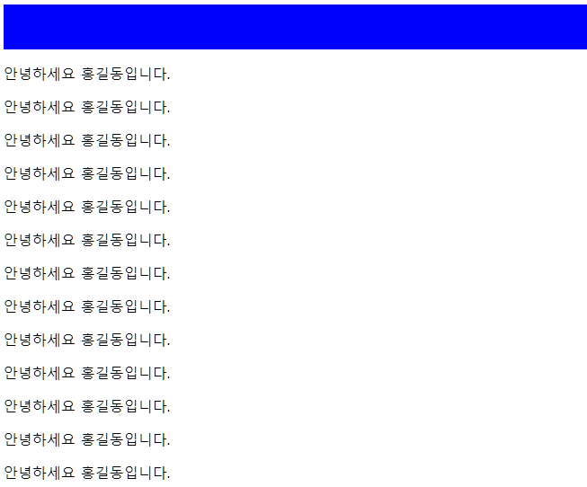
position sticky
html
<!DOCTYPE html>
<html lang="en">
<head>
<meta charset="UTF-8" />
<meta name="viewport" content="width=device-width, initial-scale=1.0" />
<title>Document</title>
<link rel="stylesheet" href="./css/16_position_sticky.css" />
</head>
<body>
<!-- 메뉴 -->
<div class="top-bar"></div>
<!-- 본문 -->
<div class="container">
<p>안녕하세요 홍길동입니다.</p>
<p>안녕하세요 홍길동입니다.</p>
<p>안녕하세요 홍길동입니다.</p>
<p>안녕하세요 홍길동입니다.</p>
<p>안녕하세요 홍길동입니다.</p>
<p>안녕하세요 홍길동입니다.</p>
<p>안녕하세요 홍길동입니다.</p>
<p>안녕하세요 홍길동입니다.</p>
<p>안녕하세요 홍길동입니다.</p>
<p>안녕하세요 홍길동입니다.</p>
<p>안녕하세요 홍길동입니다.</p>
<p>안녕하세요 홍길동입니다.</p>
<p>안녕하세요 홍길동입니다.</p>
<p>안녕하세요 홍길동입니다.</p>
<p>안녕하세요 홍길동입니다.</p>
<p>안녕하세요 홍길동입니다.</p>
<p>안녕하세요 홍길동입니다.</p>
<p>안녕하세요 홍길동입니다.</p>
<p>안녕하세요 홍길동입니다.</p>
<p>안녕하세요 홍길동입니다.</p>
</div>
</body>
</html>
css
/* position : sticky (고정) */
.top-bar {
/* 세로 */
height: 50px;
/* 배경색 */
background-color: blue;
/* 고정, 좌표 부활(left/top/right/bottom) */
position: sticky;
/* 위쪽(y좌표) */
top: 0;
}
결과
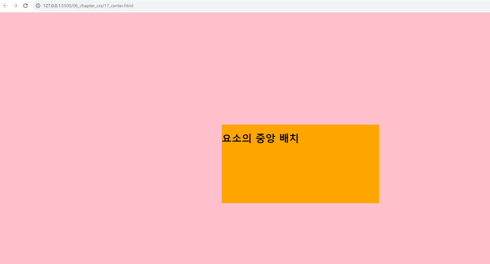
transform
html
<!DOCTYPE html>
<html lang="en">
<head>
<meta charset="UTF-8">
<meta name="viewport" content="width=device-width, initial-scale=1.0">
<title>Document</title>
<link rel="stylesheet" href="./css/17_center.css">
</head>
<body>
<div class="container">
<h1>요소의 중앙 배치</h1>
</div>
</body>
</html>
css
body {
/* 배경색 */
background-color: pink;
}
.container {
/* 가로 */
width: 500px;
/* 세로 */
height: 250px;
/* 배경색 */
background-color: orange;
/* 절대좌표 */
position: absolute;
/* 왼쪽(x좌표) */
left: 50%;
/* 위쪽(y좌표) */
top: 50%;
/* 애니메이션 함수 : div를 위치 이동시키는 함수 */
/* 보정 : 박스의 가로/세로 크기의 반만큼 위치 이동해야 중심이 중앙에 위치함 */
/* 사용법 : transform: traslate(가로크기, 세로크기) */
transform: translate(-50%,-50%);
}
결과
'HTML > Css' 카테고리의 다른 글
| [CSS] (0) | 2023.08.16 |
|---|---|
| [CSS] 홈페이지 만들기 (0) | 2023.08.14 |
| [CSS]특수 선택자, 가상 선택자 글꼴, 선택자 우선순위, div ,span (0) | 2023.08.09 |
| [CSS] box collapse schedule (0) | 2023.08.08 |
| [CSS] box, border, padding, margin, width (0) | 2023.08.07 |